In today’s digital landscape, competition is fierce. We’re bombarded with apps, websites, and software, all vying for our attention. What makes us choose one over the other? The answer: a positive user experience (UX).

UX: Designing for Delight
UX goes beyond aesthetics. It’s about understanding your users, their needs, and crafting an experience that feels effortless and enjoyable. A well-designed interface is intuitive, clear, and guides users towards their goals seamlessly. Think of it like a well-written story; it keeps you engaged and wanting more.
The Benefits of Great UX
Here’s a glimpse of the magic it weaves:
- Boosted Engagement : A user-friendly interface keeps people coming back for more. They can find what they need quickly and efficiently, leading to higher engagement and satisfaction.
- Happy Users, Loyal Fans: When users have a positive experience, they’re more likely to trust your brand and become loyal customers. They’ll sing your praises online, recommend your product to their friends, and become your biggest cheerleaders.
- Effortless Conversions: A well-designed UX removes roadblocks and guides users towards completing your desired actions. Whether it’s making a purchase, signing up for a service, or leaving a review, a smooth UX experience paves the way for conversions.
- Reduced Support Costs: A user-friendly interface means fewer support tickets and frustrated calls. When users can easily navigate your product, they’re less likely to need help, freeing up your resources for other areas.
- A Competitive Edge: In a crowded marketplace, a stellar UX can be your secret weapon. It sets you apart from the competition and attracts users who value a smooth and enjoyable experience.
- UX is a Brand Differentiator: A well-crafted UX experience sets your brand apart. It demonstrates that you value user experience and prioritize user needs. This builds trust, establishes you as a customer-centric brand, and positions you as a leader in your industry.
Ready to Craft a UX Fit for Royalty?
Here’s your royal design toolkit:

Know Your Users: Before you build your digital kingdom, understand your target audience. What are their goals and pain points? Conduct user research and become their advisor, not just their designer.

Usability is King: Make sure your interfaces are intuitive and easy to navigate. Put yourself in the user’s shoes and test, refine, and test again. Complexity is the enemy of a good UX.

Keep it Simple: Avoid clutter and unnecessary features. Focus on what truly matters for the user experience. Remember, a clean and organized castle is easier to navigate than a hoarder’s den.

Details Matter: Every interaction point counts. From button placement to loading times, pay attention to the user’s journey as a whole. It’s the little things, like well-placed torches and sturdy staircases, that make your digital castle a delight to explore.

Listen and Learn: Continuously gather user feedback and use it to refine your UX. Think of it as conducting user surveys to improve your reign. They are your best source of insight, after all.
From Frustration to Delight: A Tour of Good and Bad UX Example

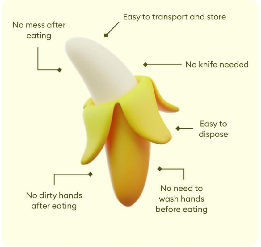
The banana is indeed a fantastic example of great User Experience (UX) in nature’s design! Here’s how it excels:
- Visual Cues: The color of a banana is a clear indicator of ripeness. Green means unripe, yellow signifies it’s perfect for eating, and brown spots suggest it’s past its prime. This eliminates any guesswork or need for complicated instructions.
- Easy to Open: The peel serves as a natural, built-in packaging that’s easy to remove. No tools or utensils required! It also protects the fruit inside from damage until you’re ready to eat it.
- Single-Serving Size: Bananas come in convenient, individual portions, eliminating the need for measuring or cutting. Perfect for on-the-go snacking.
- Easy to Eat: No preparation is necessary. Just peel and enjoy! The smooth texture and lack of a pit or core make it a mess-free and user-friendly experience.
- Portable and Sustainable: The peel acts as a natural carrying case, making it easy to take anywhere. Plus, the biodegradable peel minimizes waste.

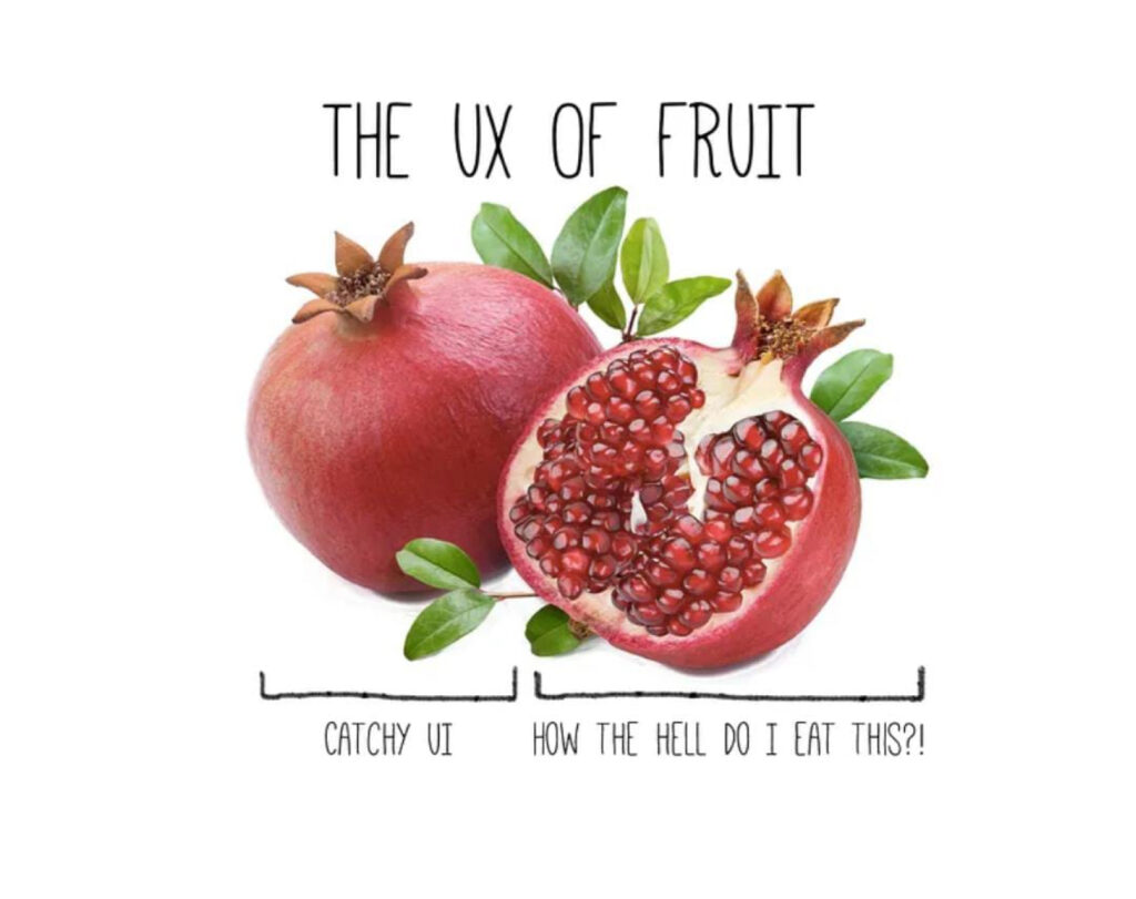
The pomegranate is a fascinating example of a food with a poor User Experience (UX). Here’s why:
- Unintuitive Packaging: The tough outer rind requires effort and potentially tools to break open. It’s not exactly a user-friendly single-serve package.
- Hidden Content: The delicious arils (seeds) are obscured by the numerous membranes, making it a messy and time-consuming process to access the edible part.
- Staining Potential: The juice of the arils can stain fingers and clothes quite easily, adding an element of frustration to the eating experience.
- Separation of Seed and Juice: Separating the juicy arils from the white membranes can be tricky, and some of the fruit’s goodness inevitably gets left behind.
- Uneven Distribution: The arils are not uniformly distributed throughout the fruit, leading to some areas being more rewarding than others.
While the pomegranate itself is a delicious and healthy fruit, its natural design presents several UX challenges. It’s a far cry from the ease of peeling a banana.

Investing in UX is Investing in Success
Prioritizing UX isn’t just about making things look pretty (although that’s a bonus). It’s about creating a product or service that users genuinely enjoy interacting with. This translates to happy customers, a thriving business, and the ultimate reward: a loyal user base that keeps coming back for more.

Hi, I am Aashish Purohit. I design experiences that make you say “wow”. UX Designer, obsessed with making social interactions smooth and delightful.I thrive in collaborative environments, working cross-functionally to bring user-centric design to life. I’m a continuous learner, always seeking new ways to improve the user experience in the digital world.
Connect with me to discuss how UX design can elevate your next project!


